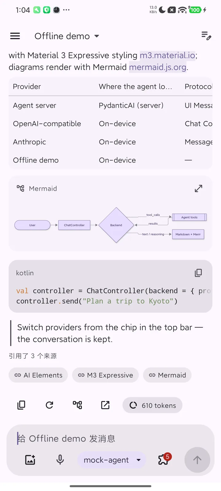
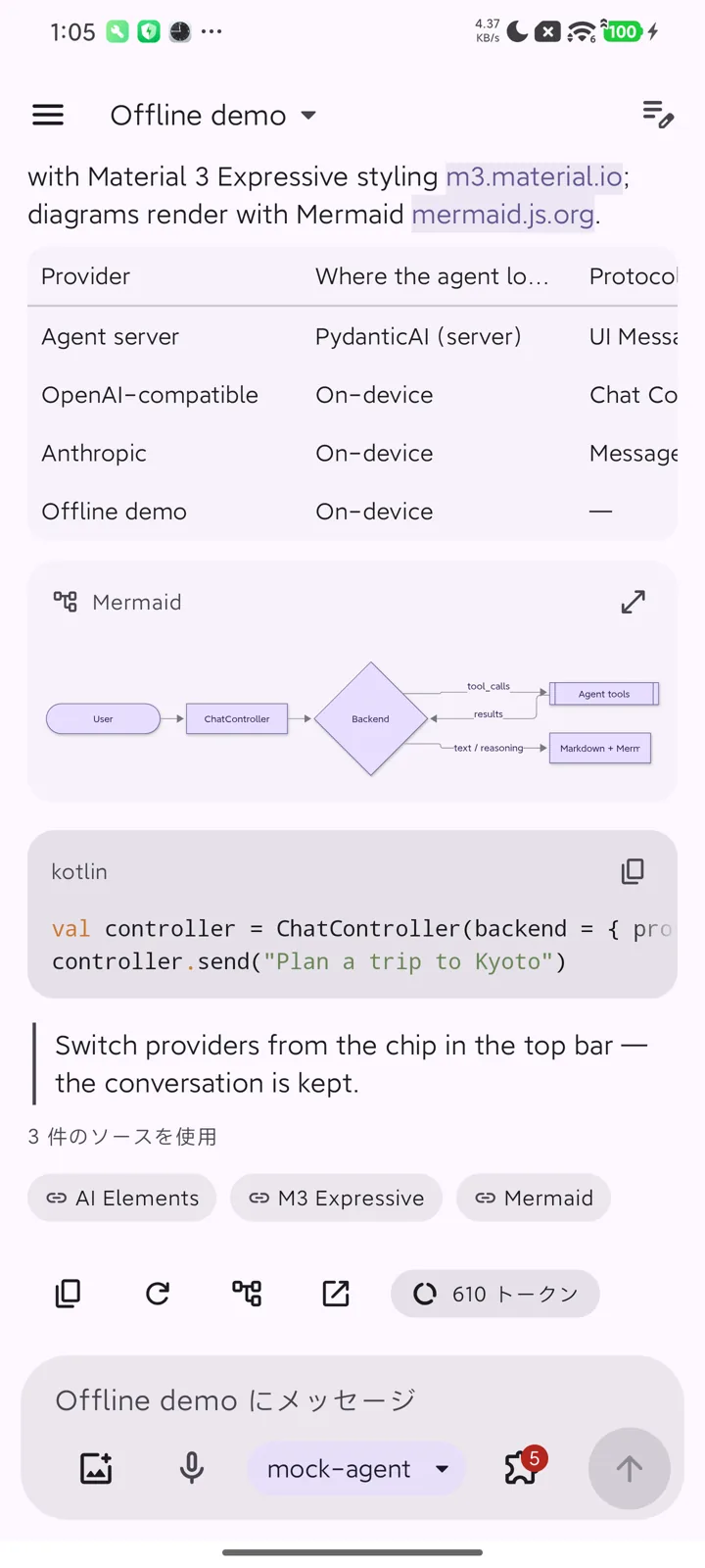
Elements
The elements are Compose counterparts of Vercel AI Elements: every one of its 49 components has one. The component catalog shows each with a picture, what it is for and its main API. The demo app's Components screen shows them live, grouped the same way, with a filter per group.
Where the names differ:
| AI Elements | Here |
|---|---|
Canvas, Node, Edge, Connection, Controls, Panel, Toolbar |
WorkflowCanvas (custom nodes, toolbar and panel slots) |
Image |
FileImage (and FileAttachment in messages) |
Attachments |
FileAttachment, AttachmentStrip |
Context |
ContextUsage |
Suggestion |
Suggestions |
Shimmer |
ShimmerText |
JSXPreview |
JsxPreview in ai-elements-genui |
Question |
Question, and the choice lists of InputRequestCard when an agent asks |
| Group (package) | Elements |
|---|---|
Chat (ui.chat) |
Chat · Conversation · AgentComputerPanel · MessageItem · PromptInput · Suggestions · Reasoning · ToolCall + Confirmation · InputRequestCard · Subagent · Sources · InlineCitation · ContextUsage · BranchSelector · Checkpoint · Queue · OpenInChat · ModelSelector · Question · Agent |
Agent structure (ui.chat) |
ChainOfThought · Plan · Task · DataPartView |
Workflow (ui.workflow) |
WorkflowCanvas · agentRunGraph |
Content (ui.markdown) |
MarkdownContent · CodeBlock · MermaidDiagram · MathBlock · attachments |
Voice (ui.voice) |
VoiceMode · Persona · SpeechInput · read aloud (SpeechOutputState) · AudioPlayer · Transcription · MicSelector · VoiceSelector |
Vibe coding (ui.code) |
Artifact · WebPreview · Terminal · StackTrace · TestResults · FileTree · Commit · SchemaDisplay · PackageInfo · EnvironmentVariables · Sandbox · Snippet |
Conversation
Chat is the whole screen: Conversation (the message list) and PromptInput, wired to a
ChatController. Use the parts directly when you need your own layout; see
Quick start: pure client.
Conversation renders each message part with the matching element:
| Part | Element |
|---|---|
TextPart |
MarkdownContent: GitHub-flavoured Markdown, code with highlighting, Mermaid, KaTeX |
ReasoningPart |
Reasoning: one quiet line ("Thought for 2s") that expands |
ToolPart |
ToolCall, Subagent for delegations, a skill badge for skill loads, Confirmation while it waits for approval; its screenshots as a strip; replies that browse, run commands or edit files get the agent's computer: a live AgentComputerCard and an AgentComputerPanel beside the chat or in a bottom sheet (Steps and replay) |
SourcePart |
Sources, and InlineCitation for [n] markers |
FilePart |
images (upright by EXIF; tap for ImageViewer: zoom, pan, rotate), videos (VideoAttachment: first frame, duration, full-screen player), audio (AudioPlayer) and documents (DocumentAttachment: PDF preview and viewer; other formats open in an app) |
DataPart |
Plan, Task, A2UI surfaces, MCP Apps views, or your own renderer |
Long conversations stay at the bottom while they stream, unless the user scrolls up.
Voice
- Read aloud. Every reply has a read-aloud action (platform text-to-speech; code, diagrams and
math are skipped).
Conversationcreates the engine; provideLocalSpeechOutputto share one. - Dictation.
SpeechInputin the composer; withonCancelit shows the input level with cancel and done while listening. - Voice mode. With nothing typed, the send button of
Chat(orPromptInput(onVoiceMode = …)) opensVoiceMode: a hands-free conversation over the sameChatController. It listens, sends what the user said, reads the reply sentence by sentence while it streams, and listens again. Tap the persona to interrupt; mute or end at any time. When the agent asks for approval or an answer it pauses and offers to go back to the chat.
The engines are the device's: LocalSpeechSettings picks the recognition service (or on-device
recognition), the text-to-speech engine, voice and rate; recognitionServices() and
SpeechOutputState.engines / voices list the choices for a settings screen.
Voice uses the platform speech engines (SpeechRecognizer, TextToSpeech) and works with every
backend; no protocol is involved. ai-elements-ui declares the package-visibility <queries> for
both services; the app declares RECORD_AUDIO. Voice features hide themselves on devices without a
speech recognizer.
Terminal output
Terminal, and tool outputs that contain terminal control codes, render what a program writes for a
terminal. TerminalText in ai-elements-chat interprets the ECMA-48 / xterm subset that programs
use for output:
- SGR colours: 16, 256 and 24-bit, foreground and background;
- bold, dim, italic, underline, inverse, strikethrough;
\rand\bredraws, so progress bars end in their final state;- cursor moves and erases in the line and the display;
- OSC 8 hyperlinks.
The 16 theme colours follow VS Code's terminal in dark and light. The scrollback is 1 000 lines.
On the device, Shell gives the model the same text as plain text, as the terminal would show it,
so escape codes and redrawn progress bars cost no tokens. The sandbox sets TERM=dumb, as agent
shells do, so most programs print plain text anyway. Interactive full-screen programs (vim, top)
need a pseudo-terminal and a terminal emulator, and are out of scope for command output.
Documents
Mobile best practice for artifacts such as reports and slides:
- PDF renders in the app with the platform
PdfRenderer: the first page and page count in the message, every page inPdfViewerDialog. For text selection and search, Jetpack'sandroidx.pdfviewer (Android 9+) is the upgrade path. - Word, Excel, PowerPoint have no platform renderer. They open in an app the user has (WPS,
Microsoft Office, Google Docs, …) through
openExternally, which shares the file with acontent:URI from the library's ownFileProvider. When the agent can produce a PDF rendition, send it too: it previews inline. - Embedding an online viewer (for example Google's document viewer in a WebView) is not used: it sends the file's URL to a third party, needs a public URL and is unavailable in some regions.
Layout
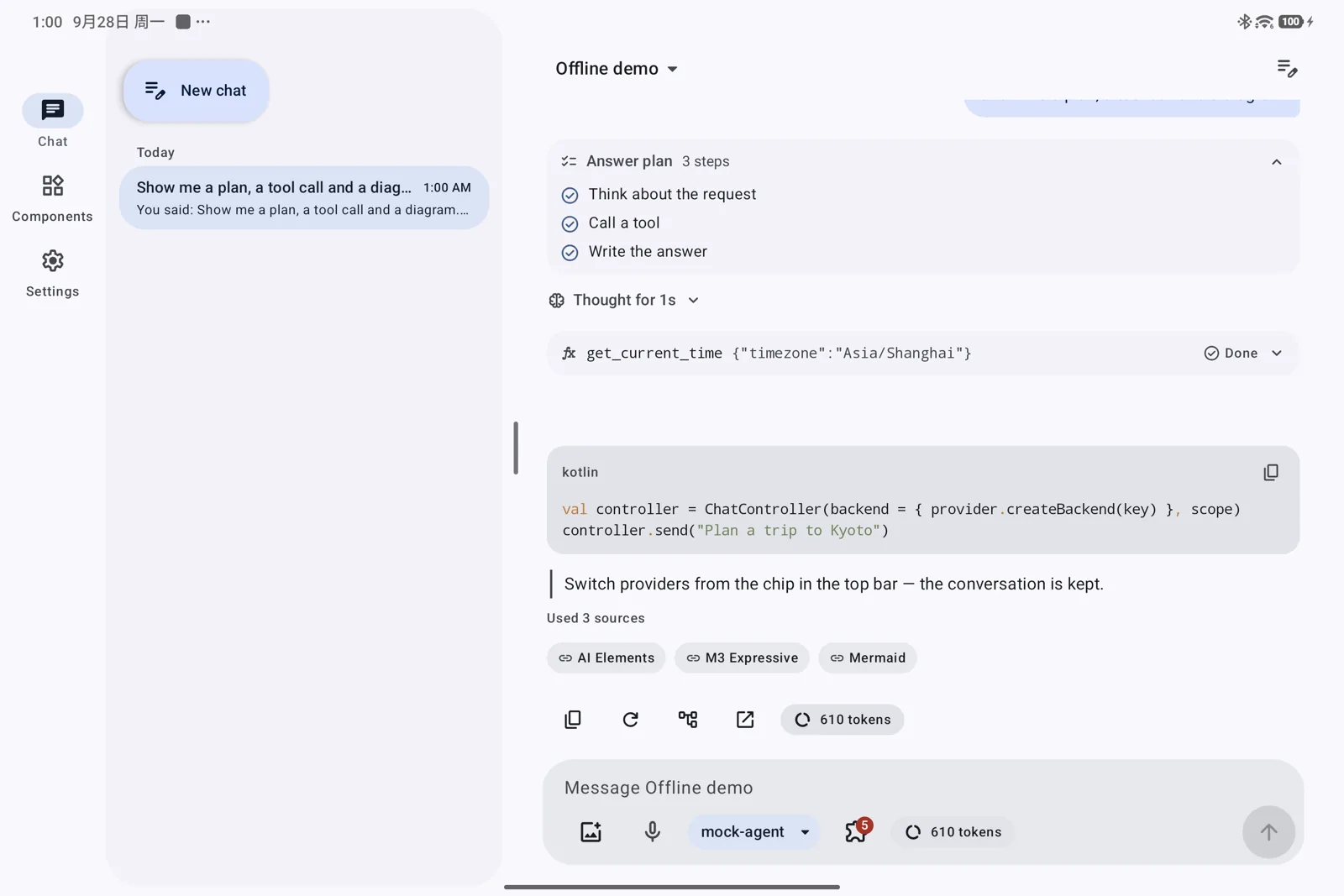
Elements adapt to the window: phones get a compact single column; tablets and foldables show the conversation history as a list–detail pane in the demo.
Theme
AiElementsTheme applies Material 3 Expressive with dynamic color by default. Pass your own
colorScheme, typography and shapes to use your brand; AiSpacing and AiType are the
elements' spacing and chat type scale. Icons are Material Symbols Rounded, generated as
ImageVectors (AiIcons), so the libraries add no icon dependency.
Languages and accessibility
Strings ship in English, 简体中文, 繁體中文 and 日本語. Elements have content descriptions, 48 dp touch targets and TalkBack semantics.